Saturday, December 31, 2016

Thrandegan

The Hobbit, Thranduil, ship, ArtzDeeva, fan art, digital art

Thrandegan: I like to make artsy things for my sister as gifts during our birthday or Christmas. This year, I gave her what she wanted. It's embarrassing, really. Ever since last year, Pinterest keeps feeding me pictures of Thranduil despite the fact that I never have posted any Hobbit related pins (not a fan of the movies) and that I haven't posted any Lord of the Rings pins in ages. After getting more Thranduil pins shoved in my faced paired with pins about weddings, I became convinced that the Internet is trying to ship the two of us together. And my sister has gone crazy with this idea, even making videos about it and creating a ship name - Thrandegan (Thrandegan x Megan, my first name).
But despite the fact that I can't stand what fuels this piece, it is still one I'm proud of. It's my first try at Photoshop painting, and while it's not pretty in places, it's a good start.
Be prepared-this may eventually become an inside joke on the blog.

Tools: Photoshop and the heat of my own embarrassment. The things I do for my twin!

Wednesday, December 28, 2016

Wildcard Wednesday #26

This week, we can expect: yet another great soul lost to 2016, the year of celebrity deaths.

Princess Leia, Star Wars, Carrie Fisher

Princess Leia: After seeing Star Wars: A New Hope, Princess Leia easily became one of my top favorite heroines of all time. And now the woman who brought her to life, Carrie Fisher, is dead. This year has already been a bad year as far as celebrity deaths go, but this loss has hit me the hardest. We love you and we will miss you, Carrie. We look forward to seeing you one more time in Star Wars Episode VIII.

(Side note: Sorry there was so little art today, I've been taking it easy and getting ready for the big changes, which I'll post about on either Friday or Saturday)

Saturday, December 24, 2016

Christmas Reflections

art, sketches, Christmas

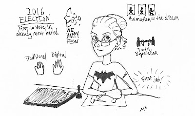
Christmas Reflections: Well, tomorrow's Christmas, and I'm so excited to be celebrating it with my family! But as Christmas draws near and the New Year dawns upon us, I can't help but think back on this crazy year.
I finally realized that animation was my dream, after three years of not knowing what I wanted to do. I got my first job, and despite feeling incredibly unhappy through most of it, I learned a lot about people in general (they're all horrible creatures-just kidding) and myself. This year was also a year of transitions-of living without my twin on a daily basis, going from traditional media to digital media in art, and finally switching from a watcher to a player with We Happy Few
And, of course, this was also my first presidential election to vote in. Why oh why did I get stuck with this one? And why oh why did we choose Trump as our president?! Anger and fear aside, I feel like this may well have been one of the most important elections I'll ever vote in. And all I'll say is I'll be glad when we don't have an arrogant carrot in the White House.
While I'm very excited for 2017, I can't deny that I'm also a little afraid, mainly because of the above subject. But the only way to move forward is to continue on and change.
And boy are some big changes coming in a week.....more details next week!
'Til then, merry Christmas, everyone.

Wednesday, December 21, 2016

Holiday Announcement

Hi, M³ here! As Christmas draws near, it's gotten really busy lately. Basically, I didn't have a chance to get anything ready for today-so there is no Wildcard Wednesday.
But I will try my best to have some finished work up for Christmas Eve. And besides, in anticipation of the New Year, there's about to be some big changes...I will put up a little announcement sometime next week about what's to happen. I think you all will love it a lot.
So until then, happy holidays everyone!

Saturday, December 17, 2016

The Plucker-Climax

The Plucker, Brom, art, fan art, sketches

The Plucker-Climax: Earlier this year/last year, I drew several story beats of Brom's The Plucker. This one takes place at the climax of the book (spoilers!). As I've said in the past, it's my dream to turn this story into an animated film (I've got drawn out diagrams, plot points, character arches from over the last year and a half, that's how much time I've spent thinking about it).

Tools: Pencil (outlining), various colored pencils, Prismacolor pens, and Faber-Castel markers.

Wednesday, December 14, 2016

Wildcard Wednesday #25

This week, we can expect: only one piece because the scanner settings got messed up and directed to the scanner that doesn't work anymore-ugh. But anyways, it's coming back to one of the subjects that kicked off this blog.

We Happy Few, Compulsion Games, Arthur Hastings, Downer, dystopia

We Happy Few-Arthur: Coming into class today, I had everything done, so I spent my time practicing and drawing Arthur Hastings of We Happy Few in Photoshop. I've been playing the game (not too much since I need a more powerful graphics card), learning the lore, and still anticipating the final version. I got inspired after seeing some 101 Dalmatians pencil tests of the human characters. I definitely want to animate Arthur and the other Downers once I get the hang of it better!

Saturday, December 10, 2016

Desoldri

Desoldri, concept art, character design, traditional art, sketches

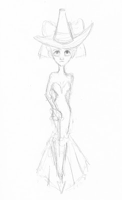
Desoldri: Last month right before fall quarter was over, I posted some sketches of two original characters of mine, Desoldri and Kurian. Desoldri's design, as I've said before, was something I could never seem to get, no matter how many redraws I went through. But I think I'm finally settling on this design of her-my finger/hand memory with this design is really good, and she has more of a distinct figure, looking less like a generic fantasy heroine.
I've made a couple mistakes in here, but I decided to finish it anyway just because I love the original lines. The coloring job is really more to show her color schema than to look perfect.

Tools: Pencil (outlining), Prismacolor pens, Faber-Castell watercolor pencils.

Thursday, December 8, 2016

(Belated) Wildcard Wednesday #24

This week, we can expect a little Arlecchino with a lot of nightmares.
(I'm so sorry I forgot to post yesterday! School started back up this week, and while it's been an incredible experience, it's been so crazy on top of everything else I've got going on my plate)

Arlecchino!, commedia dell'arte, humor, concept art, sketches

Arlecchino #10: Some more body language/rough sketches, featuring Arlecchino and Columbina.

The Nightmare, Henry Fuseli, painting, Rise of the Guardians, Pitch Black, sketches

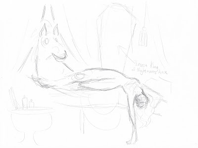
Nightmare #1: Most of you are probably familiar with Henry Fuseli's famous painting The Nightmare. If you're not, look it up-it's one of the most chilling pieces of art. It catches a woman in the heat of a nightmare, with an incubus pressing on her chest and a horse peeking through the curtains. Anyways, while I was looking at it, I was thinking about Rise of the Guardians, and I wondered, wouldn't it be cool to have Pitch Black, the King of Nightmares, in the picture? So this is one of the first practice sketches before I get the finished product up (hoping to make it in Photoshop if I can learn more about the brush and paint settings).

The Nightmare, Henry Fuseli, painting, Rise of the Guardians, Pitch Black, sketches

Nightmare #2: Another practice sketch for the Nightmare-inspired piece I have in mind. This one's just playing around with Pitch Black's positioning over the sleeping lady (since in the original, the incubus was sitting on her chest-works fine for a small demon, but not so much for Pitch).


Saturday, December 3, 2016

Arlecchino Character Sheet

Arlecchino!, commedia dell'arte, humor, character design, concept art, Arlecchino

Arlecchino Character Sheet: This was one of my finals for Vector class - we had the option to do either an illustration or a character sheet, and because I was running short on time, I went with the character sheet. While there are a few inconsistencies here and there, it's still something I'm pretty proud of.

Tools: Adobe Illustrator.

Wednesday, November 30, 2016

Wildcard Wednesday #23

This week, we can expect: a whole lot of Arlecchino (with a touch of Rise of the Guardians to welcome the holidays)

Arlecchino!, commedia dell'arte, humor, character design, concept art, sketches

Arlecchino #7: Some experimenting with body movement and positions on characters such as Arlecchino or Brighella, an inamorata, Pedrolino, and Capitano. In commedia dell'arte, there are very set movements and positions for each character. Working on that now will add character to the drawings, and later on to the animation.

Arlecchino!, commedia dell'arte, humor, character design, concept art, sketches

Arlecchino #8: Playing around with one of the servants, Columbina. I've ultimately decided to keep her usually unmasked (since most women in commedia dell'arte didn't wear masks), but for scenarios where she disguises herself, I have created a mask that will work well with the expressions on her face.
To the right of her is Vittora. She can be either an inamorata or a servant, and in my story's case, I'm making her another servant - she's like Cosette, and I'm planning on paring her up with Pierrot later.

Arlecchino!, commedia dell'arte, humor, character design, concept art, sketches

Arlecchino #9: More character sketches. On the left is Arlecchino with friend and fellow servant Pedrolino (still playing around with his design). On the right is Vittora and Pierrot meeting each other mid errand.


Rise of the Guardians #1: Recently introduced a friend of mine to Rise of the Guardians, which made me remember my own love for this film and everything about it. The Tooth Fairy's face is really awkward to draw, by the way!


Wednesday, November 23, 2016

Wildcard Wednesday #22

This week, we've just got one piece - a little Thanksgiving treat for myself. I'll probably have something for Saturday, but if I don't I'll let you know. Also, happy Thanksgiving, everyone!
But on to the most important thing - guess who's back?

Thumbelina, Hans Christian Andersen, fairy tales, sketches, doodles

Tommelise #3: Most of you probably won't remember this (literally) little lady. Earlier this summer, I cranked out some pieces like Tommelise and some sketches for Wildcard Wednesday #4. Well, I've got big plans for my projects, I'm starting before 2017 gets here (because why wait?), and among other projects that I've let collect dust, I'm bringing this one down. Tommelise will be an animated series in the future, but on here I'm going to preview it with a graphic novel treatment.
Also, I'm redesigning Tommelise's outfit. The original design is lovely, but it takes too darn long to draw.

Saturday, November 19, 2016

Chess and Ladybug

This is one of those rare occasions where I've got two pieces of art to share today-one of them is even part of my finals for fall quarter!

chess, game, black, white, king

Chess Is King-Cover: The ultimate cover for a tale of political intrigue, drama, and espionage.

Inspiration: This was the last of my three finals for Vector class. In this one, I could do whatever I wanted. I had a lot of ideas, but unfortunately I ran out of time, so I decided to do something for my Chess concept. Because they're very instilled in negative space and grayscale, they work very well in a graphic design-oriented program like Illustrator.

Tools: Adobe Illustrator, physical sketch.

Miraculous Ladybug, Ladybug, Chat Noir, animation, digital art, fan art

Miraculous-Ladybug and Chat Noir: Fighting evil on a daily basis, these teenage heroes are always ready to swing into action!

Inspiration: So if you've seen this week's Wildcard Wednesday, you'll know where this came from. But for those that haven't, I got some new drawing books last weekend, and I practiced some action poses on Ladybug and Chat Noir. I took the sketch in with me to school, scanned it, and worked on it in Illustrator. I did do line work for this, but when I took the eye off of the line layer so I could see the unbound colors, I loved the way it looked. 

Tools: Adobe Illustrator, physical sketch.


Wednesday, November 16, 2016

Wildcard Wednesday #21

This week, we can expect: no sad stuff! (Unlike last Wednesday) Showing off two new original characters and some practice leading up to one of the Saturday pieces.

art, sketches, concept art, character designs, original characters

Desoldri #2: Well it took forever, but I think I've finally settled on designs for this lady and her friend in the picture below. This young woman's name is Desoldri. Her name and the concept of the story she's in came to me in a dream, where a land lived under a fixed solar eclipse, so there was no sun and it was always night. No one believed there would be light again. But under mystical circumstances (which I can't talk about because it's still in development and SPOILERS!), Desoldri is granted the powers of the sun and sets off to restore daytime to her land.

art, sketches, concept art, character designs, original characters

Desoldri #3: Kurian is one of Desoldri's friends and her sole companion in her quest to restore the sun to their land. During the solar eclipse that got fixed, he looked into the sun's rays and was blinded, but once Desoldri is given the powers of the sun, she restores his sight. You can actually find a drawing of blind Kurian in Wildcard Wednesday #17.

art, sketches, digital art, comic action, poses, combat

Action Practice: This weekend I bought two drawing books from Michael's - one on exaggerated expressions, and one on comic book action. Everything I know about drawing the human body I've taught myself over the last year or so, through books, the Internet, images on Pinterest, etc. I intend to continue teaching myself until I can nab a life drawing class at Metro. These were practice from the comic action book, and I used what I learned to make this...

Miraculous Ladybug, Ladybug, Chat Noir, sketches, art, fan art

Miraculous Ladybug #3: Because who better to practice action poses on than superheroes? I like drawing Ladybug and Chat Noir in little funny/dramatic situations as well as any other fan artist, but to draw them in such dynamic movement like this? It's the best! During some of my work time in Vector class, I scanned this sketch in and did some work on it in Illustrator. You'll get to see the finished result this Saturday!


Saturday, November 12, 2016

M3's Art Journal Samples Part 3

Okay, so this is it-the grand finale of my art journal samples! It was also the final entry post I made, and with this one, I pulled out all the creative stops and just went crazy. Understandably so, because this entry is based on the prompt of "dream".
I am a very active dreamer. I've been keeping dream journals since I was around twelve or thirteen. So of course I couldn't pick just one. Get ready to enter my mad dream world with this extensive entry!

art, art journal, concept development, dreams

Art Journal #12: Here is Layer One (yes, this is a multi-layered) of the dream entry. The Oscars were coming up soon at the time, so I themed the first layer like a red carpet for some of the notable characters and people that have shown up in my dreams (must remember to put down Megamind's name). Some are obscured by the invitation card.

art, art journal, concept development, dreams

Art Journal #13: Under the red carpet is Layer Two, with notable scenes from various dreams I've had.

art, art journal, concept development, dreams

Art Journal #14: Detail from Layer Two.

art, art journal, concept development, dreams

Art Journal #15: Detail from Layer Two. The middle scene is actually getting conceptualized into a story (Desoldri). And yes, if you're wondering, that is Alan Cumming's Emcee from Cabaret up there with me. Those dreams have been...interesting, to say the least.

art, art journal, concept development, dreams

Art Journal #16: Layer Three-various locations and inspirational soundtrack (some songs were in dreams, others illustrate my dream life).

art, art journal, concept development, dreams

Art Journal #17: Layer Four-side one of some of the strange scenarios I've had in dreams. Fortunately for me and everyone else, my dreams are pretty safe.

art, art journal, concept development, dreams

Art Journal #18: Side two of Layer Four-more scenarios (Maud's my twin, and I have saved her a lot in my dreams. He-who-must-not-be-named isn't Voldemort, I don't remember who "he" is at the moment)

art, art journal, concept development, dreams

Art Journal #19: And last but not least, Layer Five with some notable/recurring characters in dreams. Whew! If this were Inception, we'd be in Limbo by now! Notes: usually in "saving the world" dreams, I've had Bilbo Baggins at my side. I consider him to be like a fictional uncle. Joker was my boyfriend once-and to make it weirder, he was good at the time! But I was there to see his turn to evil, so you can imagine how strange that was. The Baron, as I think I've said before, is like my muse, and he has often come to me in dreams. And while I've never saved my twin from Freddy Krueger (not yet, at least), I used the picture to illustrate how I've often saved her from bad company with my powers of no.

Well, I hope these three posts gave you a little joy (and a chuckle, no doubt). I know I had fun going back over these samples from my art journal. Hopefully now that finals are simmering down, I'll be able to put up some new finished art for next Saturday.
(Note: Any pictures or photos used in collages for this entry don't belong to me)




M3's Art Journal Samples Part 2

Continuing my pursuit of putting a little more beauty into this ragged world with part two of my Concept Development journal samples! (See Part One for previous thoughts and art)

art, art journal, concept development, Portal, Portal 2, GLaDOS, Still Alive, Want You Gone

Art Journal #7: Another Portal/Portal 2 related piece made for a lyrics prompt (I don't own the lyrics for "Still Alive" and "Want You Gone"). Played around with a concept for a human version of GLaDOS for this one. Needless to say my love for this series is everlasting!

art, art journal, concept development, Psycho, Parks and Recreation

Art Journal #8; This was a hit in class! The prompt was simply "Opposites", so I did opposite reactions from Marion of Psycho and Andy Dwyer of Parks and Recreation. With this one, I challenged myself by limiting my use of the eraser, so most of the raw, experimental pencil work is still there.

art, art journal, concept development class, monsters

Art Journal #9: This piece came from a prompt on monsters. On the way home from Shakespeare on the Green one or two years ago, I saw a man walking on the side walk in the dark, and I swear, that's what he looked like under the lamplight. Don't fully know where I was going with the quote, but I felt like having words in this piece.

art, art journal, concept development, twins

Art Journal #10: A piece I did on me and my twin. She is my best friend and she means everything to me. Most of these pictures are of us in cosplay (her, Mistress Death from Deadpool, and me as Harley Quinn). Although interestingly, the picture of her on the right is her wearing a Fire Gang mask I made as part of a Labyrinth Christmas package for her-the very Christmas before Bowie died. Talk about timing!

art, art journal, concept development, Cirque du Soleil

Art Journal #11: I did this one on an art project I started last summer just for fun- CdS Harlequinade. Because of living in Vegas, I had a fascination with Cirque du Soleil from a very early age. I didn't start looking at some of their shows until 2012, a year of existential crisis for me, and I was completely taken away by their fantastical worlds and casts of colorful characters. Harlequinade, like I said, was a way to reconnect with my childhood creator's instincts by having fun with a bunch of characters in a story of my own making. One might say it's fan fiction, but in art form. I also gave myself a challenge. In the shows, the characters speak in "Cirque talk", so there's no verbal way to know what a character is thinking, feeling, or saying. So rather than presume what they would say and write words in thought bubbles, I had to instead illustrate their thoughts and communications. It's all completely art.
Because of this horrible week (and the next four years to come), I'm resurrecting CdS Harlequinade for my own personal and artistic healing. This is a project that's not only an escape from school and everyday things, but also an escape from the ugliness currently in the States right now. Because this is a personal project and I wish to put out more original works on my blog, I probably won't post much Harlequinade art. But you might get a couple practice sketches and thumbnails in the Wildcard Wednesdays-we'll see!

So there ends Part Two-for the final part, prepare for the craziest entry in my art journal yet!
(Note: All pictures and lyrics used in collages such as the CdS Harlequinade entry don't belong to me-especially the Cirque du Soleil logo)


M3's Art Journal Samples Part 1

Because of the result of the election some of the horrible hate crimes that have followed, the world for now feels very ugly and dark to me. And what's my natural instinct as an artist? To try filling it with beauty and delight. For me, beauty in art is not just there for aesthetic purposes-it is there to heal and exhilarate. And I feel like we could all use a little something beautiful to help us in these troubled times.
So, since I ran out of time for new art (seriously, this week was the worst), let me take you into samples of my art journal from Concept Development class, one of the best classes I've ever had! I'll do this in two or three parts, since even for samples, I still have quite a few.

art, art journal, concept development

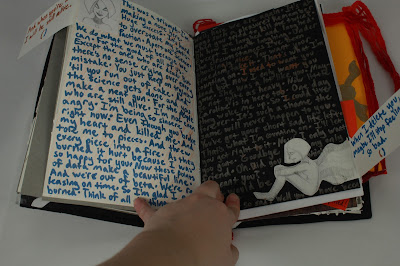
Art Journal #1: So this is the cover of my art journal. It has samples of most of the fandoms I hold dear to my heart (Lord of the Rings, Doctor Who, the Portal series, Merlin, Sherlock, and of course my childhood, Harry Potter). We had to make our own art journals, which was no easy task-blood was spilled for the making of this book. Literally. And if it looks bulky now, it definitely didn't in the beginning. As you'll see, my creativity was pushed beyond its limits and wasn't restricted to just drawings on the page.

art, art journal, concept development, sexism, collage

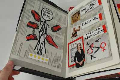
Art Journal #2: A little piece on how it sometimes feels like being a woman even in this modern day and age. This journal gave me the chance to do collages again, which were one of my favorite things as a kid.

art, art journal, concept development, childhood

Art Journal #3: A piece done on something from childhood-for the prompt, I chose to draw about a game my twin and I used to play when we were little. We would gather our favorite stuffed animals in a shoe box and send them off to Antarctica to escape rat police...yeah, it made a lot more sense when we were little. But it was so good reconnecting with that part of my life again.

art, art journal, concept development, Portal 2, Cave Johnson, Aperture Science

Art Journal #4: The prompt for this piece was a quote, so of course I had to choose Cave Johnson's defiant lemons monologue.

art, art journal, concept development, Portal, Portal 2, Aperture Science, Doctor Who

Art Journal #5; I believe the prompt for creating a crossover for one of your favorite shows. So I created a piece on the glorious crossover episode of Doctor Who you will never get-PortalWho! Again, used collage for this. And if you're wondering, yes, that's me as Chell with a plushie of Wheatley I made all by myself (I do cosplay-might put up pictures of that in the future).

art, art journal, concept development, The Mask

Art Journal #6: As ridiculous as this may sound, I was so pumped to see the Mask in my tweens-it was really the only PG-13 movie I was interested in seeing at the time. It has a wacky yet special place in my heart, I won't lie. So I did this scene (probably one of my favorites) for a movie-related prompt.

So there's Part 1 of my art journal from Concept Development class-we've only scratched the surface!
(Please note: Any pictures or photos used in collages such as the ones for the PortalWho crossover don't belong to me)


Wednesday, November 9, 2016

Wildcard Wednesday #20

This week we can expect-well, really only one drawing this time. One; because after last night, I only have the energy for one drawing, and two; I have to express my rage and grief.

Statue of Liberty, America, 2016 election, Trump

Lady Liberty Weeps: Poor Lady Liberty. What else can you say?
To the rest of the world, on behalf of my beloved yet misguided country, I'm so sorry.
I didn't vote for Trump, so I'm at least at peace with myself. But I am angry. I am ashamed. I am heartbroken. I am struck to the core at how this could actually have come to pass-that we let the biggest joke walk into the White House.
But you know what? This isn't the end.
While I may need more time to grieve, I will do what I can to fight for the things I believe in, the America I believe in. An America that welcomes foreigners with open arms. An America that loves Muslims alongside Christians. An America that respects women and their rights. All these things and more. I will do everything I can with my heart and my drawing utensils. I say 2017 is going to be the Year of the Artist, because whether it's on a piece of paper or on a stage, we'll need them now more than ever. It will not be a year of prosperity-it will be a year of productivity and revolution.
I will continue to draw Lady Liberty in the stages of this upcoming administration.


Saturday, November 5, 2016

Cupid and Psyche-Miraculous Parody

Miraculous Ladybug, Ladybug, Chat Noir, Cupid and Psyche statue

Cupid and Psyche-Miraculous Parody: When Theo comes to Ladybug and Chat Noir for an art project, Ladybug is less than happy with what they're imitating.

Inspiration: This year I went to Nebraskon as Ladybug, so I thought I'd do a throwback post to some Miraculous fan art I did a while back. This was inspired by one of the most beautiful sculptures ever, Cupid and Psyche by Antonio Canova. I thought it would be funny to draw a scenario where Ladybug and Chat Noir have to imitate the sculpture, because of course Chat Noir would love it.

Tools: Pencil (tracing), Prismacolor pens, Faber-Castell markers, and Faber-Castell watercolor pencils.

Thursday, November 3, 2016

(Belated) Wildcard Wednesday #19

Today we can expect: an old chess concept from two years ago in the process of being brought back from the dead.
(I'm so sorry I'm a day late two days in a row-yesterday was extremely busy. Well, this whole week has been busy, but things should be settling down now. Anyway, on with the art!)

chess, chess pieces, black king, white king, concept art

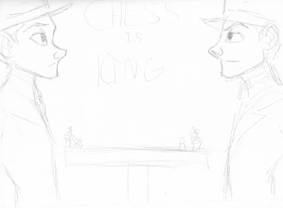
Chess Is King #2: I think I've drawn something from my chess concepts before on this blog, but now there's going to be a steadier stream of these things. Here is just a basic graphic cover concept (from left to right: Black King, Ernest, and the White King, Carlos).

chess, chess pieces, bishop, pawn, concept art

Chess Is King #3: A little melancholy scene between black pawn Emily and black bishop Lorenzo. More details on their relationship to come.

chess, chess pieces, king, concept art

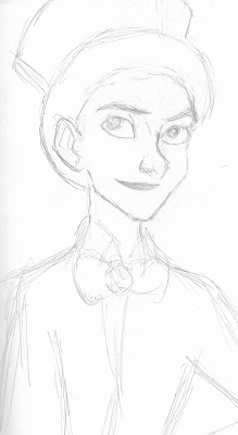
Chess Is King #4; Early concept sketch on the Black King, Ernest. I've been working on his design for years-I've struggled to make an appealing yet non-generic design for him, but I think I'm getting somewhere. He's a smart, mischievous strategist, albeit a bit of a risk taker, but he's devoted to his people and to his queen, Florence.

chess, chess pieces, queen, concept art

Chess Is King #5: Concept drawing of the Black Queen, Florence. A lady of grace and intelligence, she bears a warm heart. She can be diplomatic and peaceful, but when she's in battle mode, she's one of the fiercest and most aggressive on the Black side of the board.


Sunday, October 30, 2016

Fantasy Forest


Fantasy Forest: A little throwback to my concept development class earlier this year.

Inspiration: This was an assignment where we went through a famous wildlife photographer's pictures and redesigned one of them in a unique style. At the time, I was thinking of Sleeping Beauty, and while this woodland view definitely doesn't look like a set from there, I still wanted to make a normal bit of scenery that was heightened with a touch of fantasy.
(Sorry I'm a day late! Homework has made time fly away from me)
Tools: Faber-Castell artist pens and Infinity metallic markers.

Wednesday, October 26, 2016

Wildcard Wednesday #18

Today, we actually have a theme again! This is all themed around the Arlecchino/commedia dell'arte concept.

Arlecchino, commedia dell'arte, character designs, concept art

Arlecchino #2: Character design sheet - Arlecchino is a wild, mischievous servant who's as flexible and active as an acrobat, but often thinking with his stomach.

Columbina, commedia dell'arte, character designs, concept art

Arlecchino #3: Character design sheet - Columbina (or in some versions Smeraldina) is a kind-hearted servant with more intelligence than most servants. She's not afraid to give her master what for if he's treating her badly.

Pantalone, commedia dell'arte, character designs, concept art

Arlecchino #4: Character design sheet - Pantalone is a greedy, sleazy merchant who bosses his servants around and enjoys the company of his best friend, the Dottore (still thinking of a name for him).

Pierrot, commedia dell'arte, character designs, concept art

Arlecchino #5: Character design sheet - Pierrot is a melancholy-looking dreamer at heart, often going to work with his head in the clouds. He's quite the contrasting friend to the livelier Arlecchino.

Arlecchino, Columbina, Pierrot, Pantalone, Dottore, commedia dell'arte, concept art

Arlecchino #6: These are all possible cover designs for a graphic novel series of the Arlecchino concept. I like to go over my drawings with my Prismacolor pens, but this week was really busy and time got away from me, so that's why not all of these are inked in.